LEDControls - Reference
Contents
Applications
This 3 applications are for testing, demonstrating and some for code creation.
You can download the source code from GitHub or simply install their executables (Installer (Windows)).
SegmentDisplayConfigurator
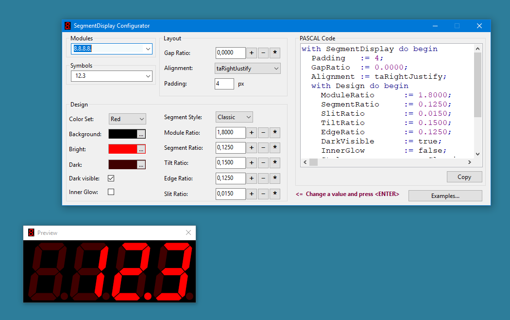
Download this application, compile and run it to explore the rich features of the control TSegmentDisplay.
Define segment modules as a string like 8.8.8.8. or 88:88. Then
enter a text that matches the modules like 12.34 or 12:20 or 12 20
Drag the previews window size, enter other property values, press <ENTER> and watch the changes.
LedMeterConfigurator
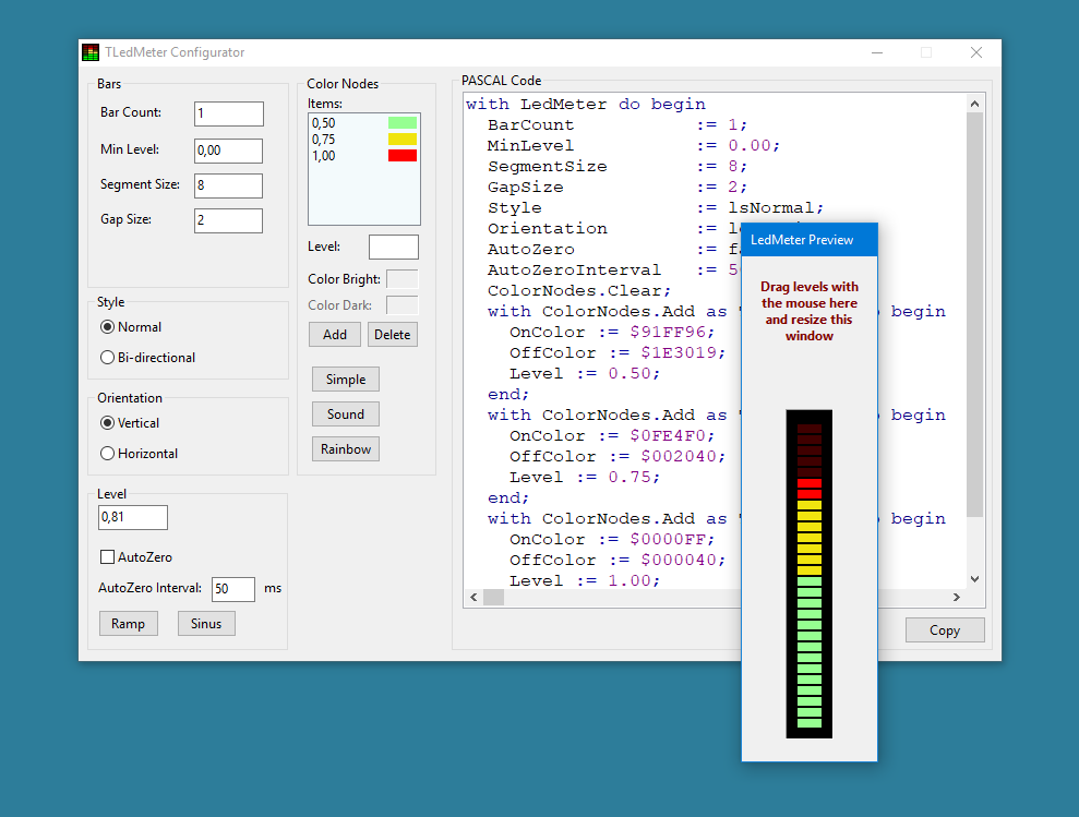
This application demonstrates the TSegmentDisplay control.
Download the applications sources, compile them to an executable and let it run.
Drag a level in the preview window to see the effects.
SignalStrengthConfigurator
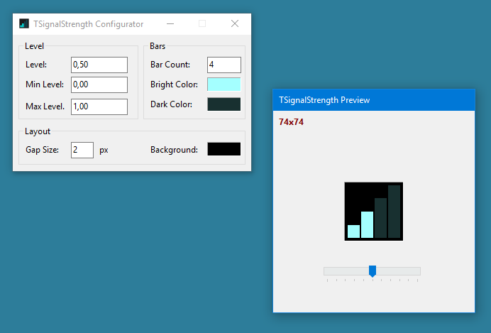
Download the applications sources, compile them to an executable and let it run.
Packages
LEDControls.lpk
The package contains 4 visual components, all descendands of TGraphicControl. See the Intro and try the Configurators to explore them.
Download
Installation
Prerequisite: a Lazarus installation.
- Create a local directory like
C:\Development\Lazarus\ATOMEK.Controls - Pull LEDControls from https://github.com/Atomek61/LEDControls.git or, if you dont have Git, download LEDControls-master.zip and unpack it
- Make sure having BGRABitmapPack installed
- Open the package in Lazarus, compile and install it
- Create a new project and place the new components in "Atomek" onto a form, read the Intro and play around with the properties
- or load one of the configurator projects to play around with the new components
Usage
Read the Intro to learn the new controls.
TBlinker Reference
TBlinker is a graphical control which toggles between two images selected from a TImageList-component. A blinker always needs the ImageList assigned with a TImageList-component containing at least two images: A dark one and a bright one.

Before using a TBlinker, place a TImageList on your form and fill it with
some images. The above displayed led images are delivered with the
package in the res folder.
To let a blinker blink, set its Active-property to true. If the
Mode-property is bmContinuously the control will blink
until it is stopped manually with Active:=false;.
In Mode=bmKeepAlive the control will blink once (or n times) and stay
dark until the next Active:=true. This assignment may be repeated
as often as needed - the blinking interval will be constant. Use this
mode to show any active state, e.g. incomming data, an erroneous state
and so on.
Properties
ImageList :TImageList
Mandatory: assign an existing ImageList with at least two images. One for the bright state and one for the dark state.
Some predefined LED 16x16 images are shipped with the package.
ImageIndexOff :integer
Index of the image when IsOn=false.
ImageIndexOn :integer
Index of the image when IsOn=true.
IsOn :boolean
If IsOn=true then the bright image (indexed by ImageIndexOn)
is shown.
When the LED shall not blink, control its state by setting this property.
Active :boolean
Set this property to true to let the control blink.
If the control blinks continuously or only once is controller with
the Mode-Property.
Interval :integer (ms)
Blinking Interval between bright and dark state in milliseconds.
Mode :TBlinkingMode
bmContinuouslylets the control blink continuously untilActive=falsebmKeepAlivelets the control blink afterActive=true. The control becomes dark automatically after blinkingKeepAliveBlinktimes.
KeepAliveBlink :integer
TSegmentDisplay Reference
Derived from TGraphicControl this control lets you display numbers in an LED 7-Segment display style.
Example: set Modules:='8.8.8.' and Text:='1. 3.'
will display 
Modules and Text must match. Otherwise the
result may be undefined.
Properties
Modules :string
This property defines the "physical" modules of the display.
Physical 7-segment displays would be selected from a vendor and
assembled to a unit. In a similar way you have to select software
modules and store them in the single string Modules.
A parser will create a list of TModuleType objects corresponding to
this definition.
The Text properties symbols will be assigned to the modules
from right to left.
It is a good idea to create numbers for the Text with
the Format function. Example:
								Modules:='888.88';

								Text:=Format('%6.2f', [Value]);
Important: An empty (dark) module needs a <SPACE> as symbol.
In other words: to realize a dark module, use <SPACE>. This is
valid for all kinds of modules.
To get a blinking double-dot assign alternating <SPACE>- and ':'- symbols to the ':'-module.
Available modules and symbols:
| Module | Description | Symbols |
|---|---|---|
8 | Simple 7-segment module | 0123456789ABCDEF-? |
8. | Simple 7-segment module with dot | 0123456789ABCDEF-?., |
: | Double-dot | : |
_ | Spacer | |
Text :string
Assign a sequence of symbols to this property to display a value. The
symbols must match the Modules-property.
To display numbers use the Format function for filling the dark modules.
<SPACE> always displays a dark module.
The question mark '?' has a special meaning. It is a placeholder of
a user-defined symbol. The OnDrawSegments event will be fired on
each occurence of this symbol.
Alignment :TAlignment
Use taLeftJustify, taRightJustify, taCenter to adjust
the modules inside the controls bounding rectangle horizontally.
The vertical size of the bounding recangle defines the modules height.
Design :TDesign
This is a container for a list of properties which define the modules layout.
Design.ModuleRatio :single (>0.0)
Defines the modules ratio Height/Width.
Design.SegmentRatio :single (>0.0)
Defines the broadness or thickness ratio SegmentWidth/ModuleHeight of the segments.
Design.TiltRatio :single (>=0.0)
Defines the tilt of the modules as Tilt/ModuleHeight.
Design.SlitRatio :single (>0.0)
Defines the width of the slit between segments. It is the ratio Slit/ModuleHeight.
Design.EdgeRatio :single (>=0.0)
Defines the corner width of the segment modules (bevel) as EdgeWidth/ModuleHeight.
Design.DarkVisible :boolean
Defines, if dark parts of the module have a dark color or the background color.
Design.InnerGlow :boolean
An inner glow tries to give the segments a more realistic look. It shows a circular gradient from insode to outside as if there is a lamp shining behind a glass. As a drawback this makes the whole module slightly darker.
For LCD styled modules this makes no sense because they dont have an LED.
Design.BackgroundColor :TColor
Defines the controls background color.
Design.BrightColor :TColor
Defines the segments color, when the segment is on.
Design.DarkColor :TColor
Defines the segments color, when the segment is off. If DarkVisible=false
then this value is ignored.
Design.Style :TStyle
ssClassicis the most common style of 7-segment displaysssBlockhas straight blocks as segmentsss80thsimilar tossBlockbut looks nicer because the corners are rounded.
Padding :integer (>=0)
Defines the space in pixels around the modules.
GapRatio :single (>=0.0)
Defines space between the modules refered to the module height.
OnDrawSegment :TDrawSegmentsEvent
Define this callback to decide which segments are bright.
Assign a set of TSegment values to the var Segments. See
for the position of SegA..SegG
Example:
procedure SegmentDisplay1.OnDrawSegment(Sender :TObject; SymbolIndex :integer; var Segments :TSegments);
begin
	if SymbolIndex=3 then
		Segments := [SegA, SegD, SegG];
end;
TLedMeter Reference
Derived from TGraphicControl this control lets you display single precision values as bars consisting of small led elements.
See the Intro for examples.
Properties
Level :single
This is the value to be displayed, if the BarCount=1.
The valid range is defined by MinLevel and the Level
f the highest ColorNode
if Style=lsNormal.
If Style=lsBiDirectional then MinLevel is
always 0.0 (the bar is symetric around 0.0).
Note: the lowest segment (if Style=lsNormal the
MinLevel-segment, otherwise the zero-element in the
middle) will always flow if the control has Enabled=true.
BarCount :integer (>=1)
Defines the number of bars to be displayed. If BarCount=1
then you can set the current level with Level:=value
or with Levels[0]:=value. If BarCount>1
then you can set the levels with array-property Levels[i]:=value.
ColorNodes :TColorNodeCollection
A list of TColorNode-Elements, each defining a level, an
OnColor :TColor and an OffColor :TColor.
In the simplest case there is only one element and the bars will
be monochrome.
The Level property defines the level to which the segments
are to be drawn bright with the defined OnColor. The
dark color of the segment is defined OffColor-property.
A simple way to assign color nodes at runtime is to call
SetColorScheme with one of the parameters:
lcsSimple, lcsSound, lcsRainbow.
MinLevel :single
If the Mode is lmNormal
this property defines the lowest possible value of the current level.
Defining a negative value is usefull, if the control displays logarithmic values.
SegmentSize :integer (>=0)
This property defines the height of a segment. The width is
determined by the available space. The number of segments
of a bar is determined by the SegmentSize and the
available space.
A value of 0 indicates that the segments are quadratic.
GapSize :integer (>=0)
This defines the slit size between segments and bars.
Orientation :TOrientation (loVertical, loHorizontal)
Yes. It is what it sounds like.
Style:TStyle (lmNormal, lmBiDirectional)
lmNormal means that the level range is from
MinLevel
to the highest nodes Level.
lmBiDirectional display a symetric bar wich is good
for displaying values which move around zero.
AutoZero :boolean
This property lets all values automatically decrease against the
minimal level. The decreasing speed is controlled in milliseconds
by the AutoZeroInterval-property.
AutoZeroInterval :integer [ms]
This interval controls the speed of decreasing the levels if
AutoZero=true.
A value of 20 to 50 milliseconds is a good choice.
MaxLevel :single (readonly)
The value of the last ColorNodes level.
Range :single (readonly)
The led-meters range (Mode=lmNormal: MaxLevel-MinLevel, Mode=lmBiDirectional: 2*MaxLevel).
Levels[Index :integer] :single
Assign values to this array to display the levels if
BarCount>0.
Methods
function ItemAt(x, y :integer; out Col, Row :integer; out ALevel :single) :boolean;
Use this function in mouse-events to find the bar (Col), the segment (Row) and the level to which the mouse points to.
procedure SetColorScheme(Value :TColorScheme);
Use this procedure to select one of the predefined
ColorNodes
collection.
TSignalStrength Reference
Derived from TGraphicControl this control lets you display a single value like a signal strength.
See the Intro for examples.
Properties
BarCount :integer
Number of bars to be displayed. This is usually 4.
MinLevel :single
Lowest possible level. Use negative values if you display logarithmic levels.
MaxLevel
Maximum possible level (full-scale deflection);
Level :single
Current level to be displayed.
GapSize :integer
Slit between the segments in pixel.
OnColor :TColor
OffColor :TColor
Colors of the segments.
Units
controls.blinker.pas
The control TBlinker is defined in this unit.
controls.segmentdisplay.pas
The control TSegmentDisplay is defined in this unit.
controls.ledmeter.pas
The control TLedMeter is defined in this unit.
controls.signalstrength.pas
The control TSignalStrength is defined in this unit.
registerledcontrols.pas
This unit is needed by the package to integrate the controls into the IDE. It links the symbols to the package and registers the controls in the palettes page "Atomek".
types.led
This unit contains some color definitions used by some of the led controls.